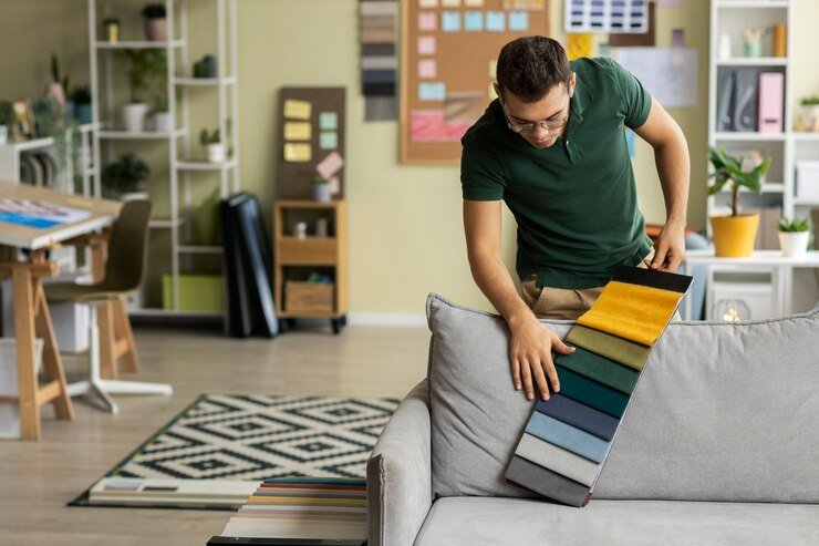
A color scheme in interior design is the selection of different colors combined to form one original, interesting space. Color schemes are essential as interior design elements set a mood, create an impression, and improve the room’s aesthetics. Styles utilized include the color wheel, combining complementary or analogous colors and warm and cool shades.
Art and nature or personal color preferences can inspire some color schemes that can also be neutral in color and calming or strong and dramatic. If the proper colors are chosen, they add definition to architectural features, give an impression of spaciousness, and carry the character of the newcomers, making the space warm and stylish.
Color Palette For Home: Warm Earth Tones
Warm earth tones from nature, like terracotta, sandy beige, deep oranges, and olive green, allow people to feel warm, especially when that warmth is paired with browns. Such warm shades are perfect for living rooms, bedrooms, or even kitchens, as they create a sense of comfort and coziness. They go well with rustic materials like wood and stone, giving the space a boho vibe. Metallic shades such as copper or gold can also be incorporated in moderation to add some liveliness to the palette.
Historical Romance
As in Other cultures, Colors like dusty baby pink, Light purple, muted greens, and creamy white create sophistication. Historical romance palettes also suit formal spaces like dining rooms and master bedrooms. Stuffed with antique cabinets, ornate frames, and finer fabrics like velvet and silk, these can also be located together. The most important thing is to ensure that the balance between all elements remains soft and even in appearance and content.
Laid-Back Blues
Laid-back blues are the best styles to promote relaxation and calmness. This palette focuses on gentle and calming colors such as sky blue, navy, seafoam, and powder blue. These colors are ideal for bedrooms and bathrooms, beach houses, and other interiors that require a refreshing atmosphere as they recall the soothing blue of the sea and sky. Combine them with crisp whites, natural timber, and soft greys, and you’ll enhance the appeal of gentle colors. You might add mild golden or yellow shades for warmth to counterbalance cool tones.
Palm Springs Modern
The Palm Springs Modern color palette is cheerful, flirty, and captivating. It inclusively has shades of turquoise, bright pinks, sunny yellows, and deep greens. The palette is ideal for achieving a bold and extensive aesthetic when working on an interior or exterior design project. A stark contrast with sleek furniture, geometric patterns, and natural textures such as rattan or bamboo gives the center a drastic mid-century modern feel.
Sweet Pastels
Sweet pastels will soften the harsh appeal of a dwelling and add a fair amount of elegance to it. Blush pink, mint green, baby blue and pale lavender are great examples. Such soft colors will work wonders in a nursery bathroom or any other room where the goal is a casual yet cozy feeling. You will prefer coupling light pastels with white beiges or other light neutral colors to line up the balance in a space. If need be, you can incorporate light wood or subtle metallic accents for a clean touch.
Rich Jewel Tones
Rich jewel tones and emerald green, sapphire blue, ruby red, and amethyst purple exemplify the luxury that rich jewel tones depict. These dark and sultry shades are ideal for use in dining rooms and libraries or as accent walls in living areas. Deep jewel tones are further enhanced by dark wood, metallic elements like brass or gold, and soft materials like velvet or leather to complete the extravagant look. Although jewel tones are powerful, they add to the overall beauty of your home design while establishing a central focus.
Desert Chic
Desert Chic looks at the muted palette of warm colors of the desert for inspiration. This palette features sandy beiges, warm terracotta, dusty pink and soft browns, rust, and deep coral accents. It best creates an earthy, relaxed ambiance in a living room, bedroom, or outdoor area. These colors go well with natural textures like wood, leather, woven fabrics, and plants or cacti.
Forest-Inspired
The Forest palette the calming and grounding essence of nature into your home. cool Greens, Brown, and Blue hues, which replicate the earthy, balanced elements found in nature, specifically like a forest. Adding these colors to the mix gives the living room, study, or bedroom a calm and peaceful atmosphere. To enhance these colors, pairing with elements such as wooden furniture, stone accents, and plants gives a true forest representation.
High-Contrast Neutrals
High-contrast neutrals are statement colors created from strong black and white, gray, and beige or taupe. This makes the design sophisticated and sleek, which looks good for modern minimalist or industrial-style spaces. The end scenario results in spaces that have a staggered depth, perfect for creating extremes with their blacks, whites, and grays combined with nuanced furniture with metallic and textured accents.
Airy Neutrals
Airy Neutrals, light grays, lightly tinted taupe, and pale beige are examples of colors used in airy neutrals. These colors allow for a sense of calm and openness, allowing room or space to feel bigger than they are. Airy neutrals, for example, allow a friendly and warm ambiance for a living room, bedroom, and kitchen. Pair any airy neutral with light linens or soft cotton and wool for the optimum combination.
Think about how you want the room to feel like
It’s essential that when creating a room, you have a color palette plan. The right colors can make a room feel welcoming or give it a different mood. Below, I have mentioned a few colors that would evoke key feelings while preparing your color palette:
- Relaxing and Calming: Soft blue, green, and neutral are ideal colors for specific areas like bedrooms and bathrooms since they help to relieve stress and sedate the person using the room.
- Cozy and Inviting: a color palette of earthy brown, terracotta, and soft yellow can be employed for those who want a more warm and welcoming look for the built room. These colors suit a living or family room.
- Energizing and Bold: Colors such as red, orange, or yellow can be used for stimulating areas like an office and other such places and can be ideal colors for an invigorating effect.
- Sophisticated and Elegant: Deep blues and greys or jewel-toned colors are great for formal rooms, including a dining room or a parlor, since they give a more elegant and luxurious look.
- Fresh and Open: Light colors like grey and pastel tones help make a room appear larger and more open, especially for smaller areas or in cases where more light is to be used.
Adjusting the mood one intends to recreate allows one to settle for a color scheme that matches the functions a room is designed for and the feeling one wants to evoke or experience.
Color Palette Generators for Interior Design
Color palette generators are excellent for creating color combinations suitable for interior design. They assist you in selecting appropriate colors depending on the theme, style, or personal preference, which simplifies the design process. Below are a few color palette generators popular in interior design:
- Adobe Color Wheel: Adobe Color enables its users to make color palettes based on their preferred color wheel and response times alongside complementary, analogous, and triadic schemes of color. Among other things, it helps test different sorts of color harmonies.
- Paletton: Paletton is an online and interior color scheme designer. You are free to play around with one color, two, or three colors, vowing them with colors that complement each other or are triadic.
- Canva Color Palette Generator: Another tool is Canva, which provides an easy color palette generator where you can upload an image and have the tool pick colors. This helps you prepare a color palette for a certain item or image you like for a more personal fit.
- Color Hunt: Color Hunt is a color palette created by the design team. This is for the love of color and can be used and directed by anyone browsing thousands of created colors grouped in categories and themes.
- ColorSpace: For ColorSpace, you can also have a base color; this tool will automatically create the color palette for you. You can quickly play around with the settings to have complementary, triadic, or analogous colors and form a pleasing palette.
- Sherwin-Williams ColorSnap: Would you like to create a color palette with your favorite Sherwin-Williams paints? With Sherwin-Williams ColorSnap, you can explore the total Sherwin-Williams paint collection and make collages out of their colors by uploading images or selecting their paints.
- Design Seeds: Suppose you are searching for colors for a room and looking to work on a specific theme and mood, like natural elements. In that case, Design Seeds offers photography-based color palette collections, which you will find helpful.
- ColorZilla: Colorzilla is an extension for web browsers that aids in color collection and palette making from websites. This tool is beneficial for developing color schemes based on more or less existing parts or inspirations derived from other sites.
- ColorLion: Color Lion is rather simplistic when you want to create captivating palettes for your interior projects, and it is ideal for people who are new to palettes. It gives you an array of palettes suitable for different hues and blends seamlessly with other designs. These tools enable the effortless exploration and creation of color combinations, all hoping to add more charm and feel to any design.
Lessons Learned
Although the examples above illustrate the color palettes that interior designers have at their disposal today, they equally demonstrate how the tactical application of color can affect the psychology of a room. Color can ignite emotions, create moods, and even set different atmospheres that are never coincidental. The right percentages and color combinations to suit them ensure the peace and beauty of the place in question.
In using basic ideas such as an analogous color palette(uses colors that are beside each other on the color wheel) or seasonal colors(e.g., using colors that are associated with particular seasons), designers can create spaces that are unique in the sense that they represent certain personalities and reasons. Because there are so many available colors, there is a lot of room for imagination- If one wants their space to be a soothing section decorated in soft shades of blue or a bustling and lively space decorated in colors, the possibilities are endless.
Quick Tip: Choose soft blues for relaxation and vibrant colors for energy to match your room’s mood.
FAQs:
What is the 3 color rule in interior design?
Choose a primary color, a secondary color, and an accent color.
Which colors go together in interior design?
Complementary colors that are opposite or adjacent to each other that form a more harmonious blend (analogous) or monochrome (different shades of a single color) palettes work best in unison.
What is the 60/30/10 rule?
60% of the room is the dominant color, 30% is a secondary color, and 10% is an accent color.
What are the 3 main color schemes?
Monochromatic, complementary, and analogous.
What are the 7 color schemes?
Monochromatic, complementary, analogous, split-complementary, triadic, tetradic, and square.